Paula Scher, born in 1948, is a talented artist and designer. She went to Tyler School of Art and left with a BA in illustration. Her career started after she graduated and worked at Random House in the children’s book division. After working there a couple of years she went to CBS Records, and then about a year later she went to Atlantic Records. She then decided to go back to CBS Records, where she then worked there for eight years. She worked there as the cover department art director. While she was at CBS Records, four of her designs received Grammy nominations. Her time at CBS Records was very successful, but she left them to go after work in a more typographic field. After years, she co-founded a design firm with someone who also graduated from Tyler School of Art. The studio went through the recession in the 90’s and took a big blow. She joined Pentagram as the first female principal.

Scher was so successful in the exhibitions she held that her first one got extended to four weeks longer than planned. She is dominant in the design world because of everything she has contributed to. She has done many logos, which people do not think to stop and see as art. There is no limit to what type of art you can make, and Scher shows that. She has done album covers, logos, paintings, books, etc.

I was drawn to her paintings more than her design work. She has so much versatility in her artwork and is successful in everything she does. I take some inspiration from her work ethic and ability to do so much. She is an inspiration to artists like me who want to work digitally and traditional art.

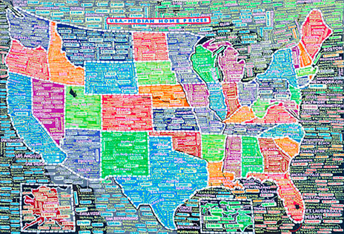
The first piece of art I looked at was one of her map paintings. In this acrylic painting is a map of the United States. As the title says, the painting shows the median home prices in the United States. It is an information overload, not giving a specific place to start when looking at the piece. Only some cities are in the painting with their median home prices, but each state has a couple of different options. Visually the states are vibrant, bright colors, but there are a lot covered by the names and numbers. This painting is super busy and is very informational to the audience.

The second piece of art by Paula Scher is an album cover for Bob James. I looked at the front of the cover where half a hot dog took up almost the whole front. There is minimal typography used, the only words are his name and the letter H. H is the title of his album and was not chosen to be highlighted as a big title. The stand-out part that catches your eye is the hot dog and then it is moved to the H and Bob James. I think there is a decent hierarchy that is working for the cover. For the colors, it is also very simple, the colors to me are reminiscent of color blocking. This album cover for Bob James is simple yet eye-catching.

Resources:
Madame Architect – https://www.madamearchitect.org/interviews/2020/7/16/paula-scher
Pentagram – https://www.pentagram.com/about/paula-scher
Famous Graphic Designers – https://www.famousgraphicdesigners.org/paula-scher
Art NeT – https://www.artnet.com/artists/paula-scher/biography
Alana Wendel is a junior graphic design student in the Art & Design program. Prior to arriving at USF, Wendel studied at the Milwaukee School of Art & Design. In addition to her studies she has a sizable collection of Funko Pop! figures.


